iQ Branding Solutions
[ ENVIRONMENTAL BRANDING COMPANY ][ SCOPE OF WORK ]-
Operating since 2009, we worked with founders Jan & Paul to redefine their strategy, visual identity, and digital roll out to reflect their growth.
From strategy to rollout, we built a bold and confident brand world that mirrors the scale and precision of their work. -
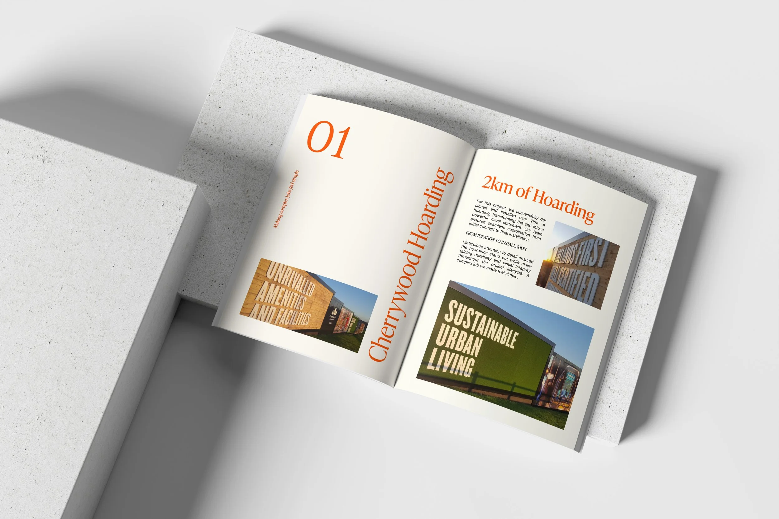
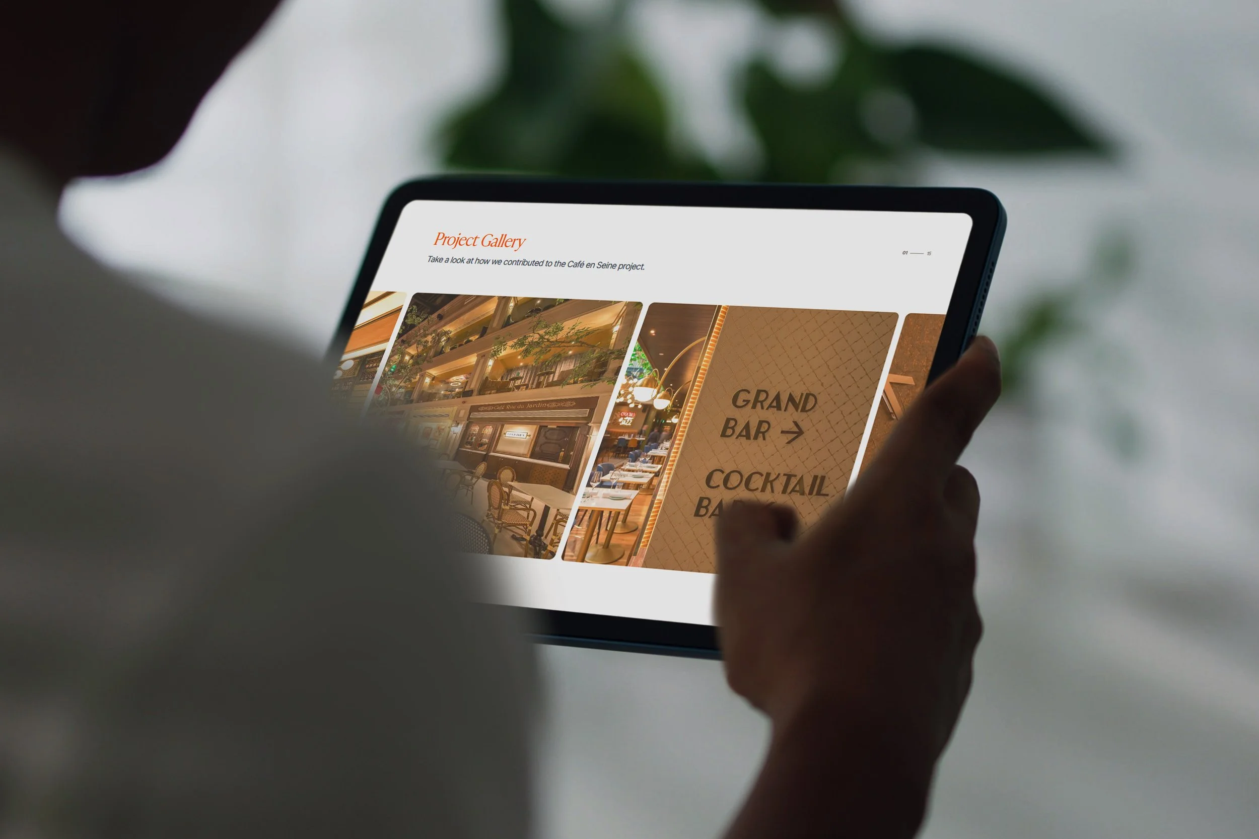
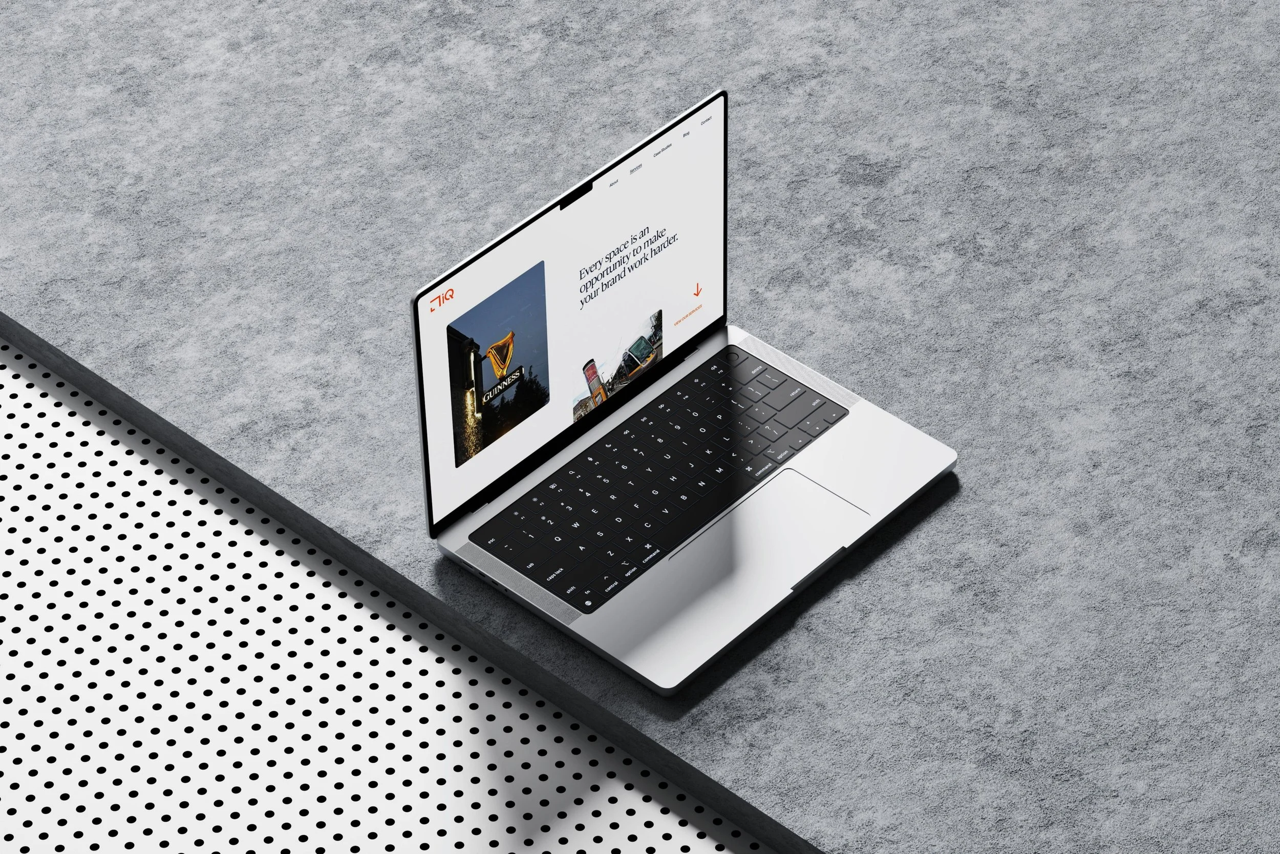
Designed & developed their new website to showcase their expertise and client calibre through a clean, modern UX — highlighting their phenomenal projects and in-house capabilities.
[ BRAND GOALS ]-
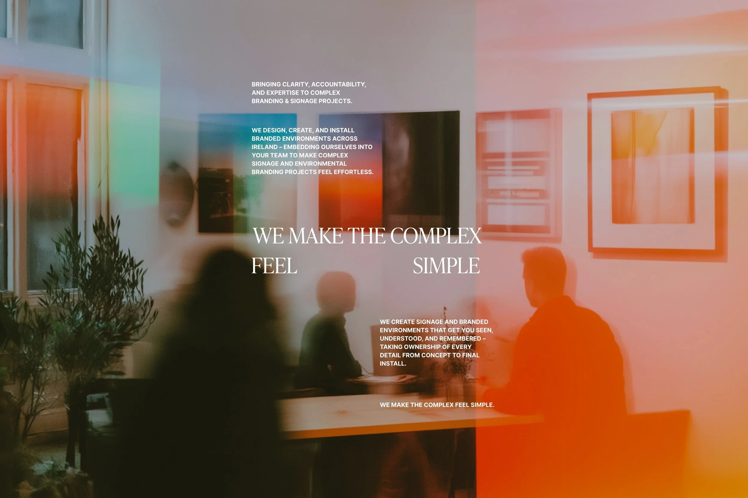
Defining the brand’s POV and fleshing out a solid strategy. This meant uncovering the idea that anchors everything they do. Operating since ‘09 we had a lot of data to work off and clients and team members to interview.
-
We refined the brand’s look through a Swiss-inspired design system that feels simple, structured, and professional, expanding on what they already had in place.
-
We designed a clean, easy-to-navigate site that highlights their case studies, showcases their expertise, and makes it effortless for clients to understand their full range of services.
[ Strategy ]
We began with workshops and conversations — founders, team, and long-time clients like Diageo and Sherry FitzGerald. To understand what really sets iQ Branding Solutions apart in their industry.
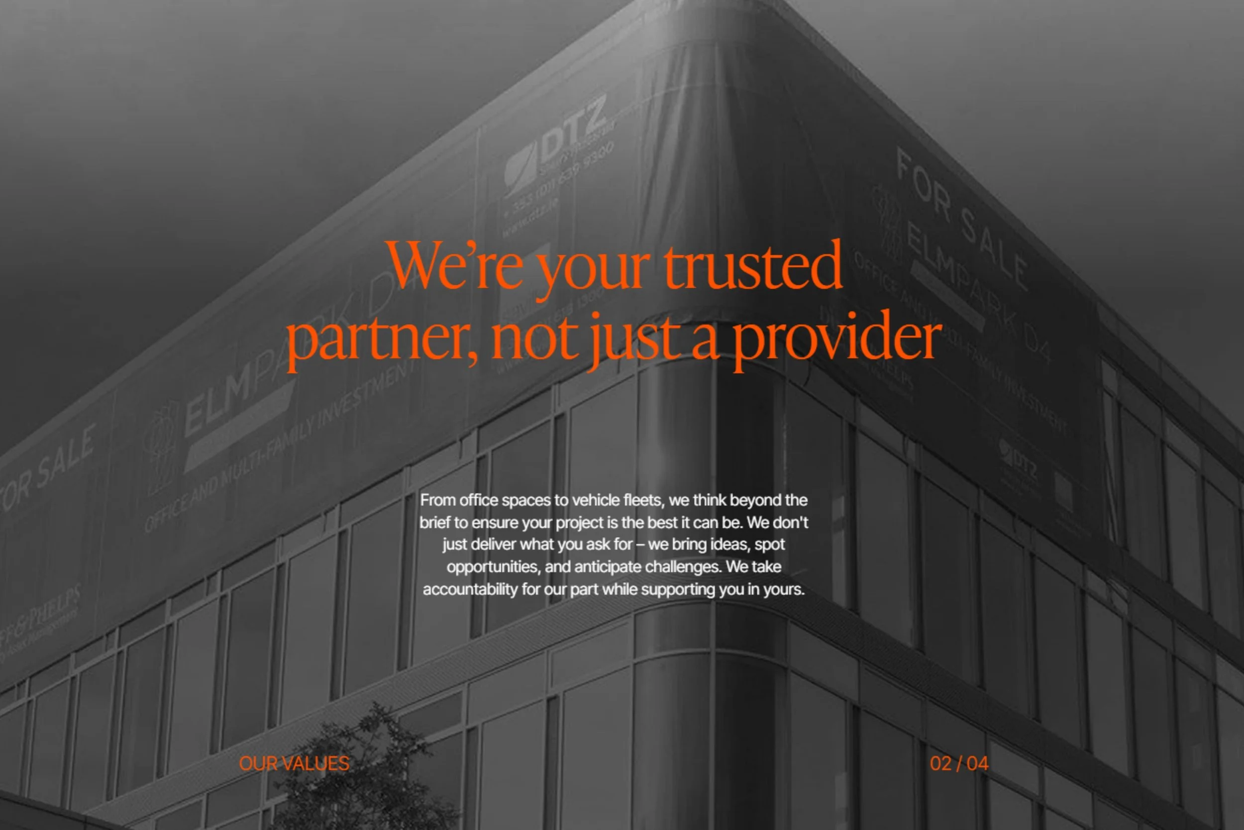
Through those conversations, patterns began to emerge. The founders and team were known for their can-do positive attitude, relentless solution-oriented mindset from the top down and an ability to manage complex projects with ease. Yes, their work was brilliant but so was the competitors so we needed a POV with which the customer could view the brand through.

The POV
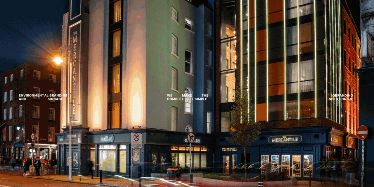
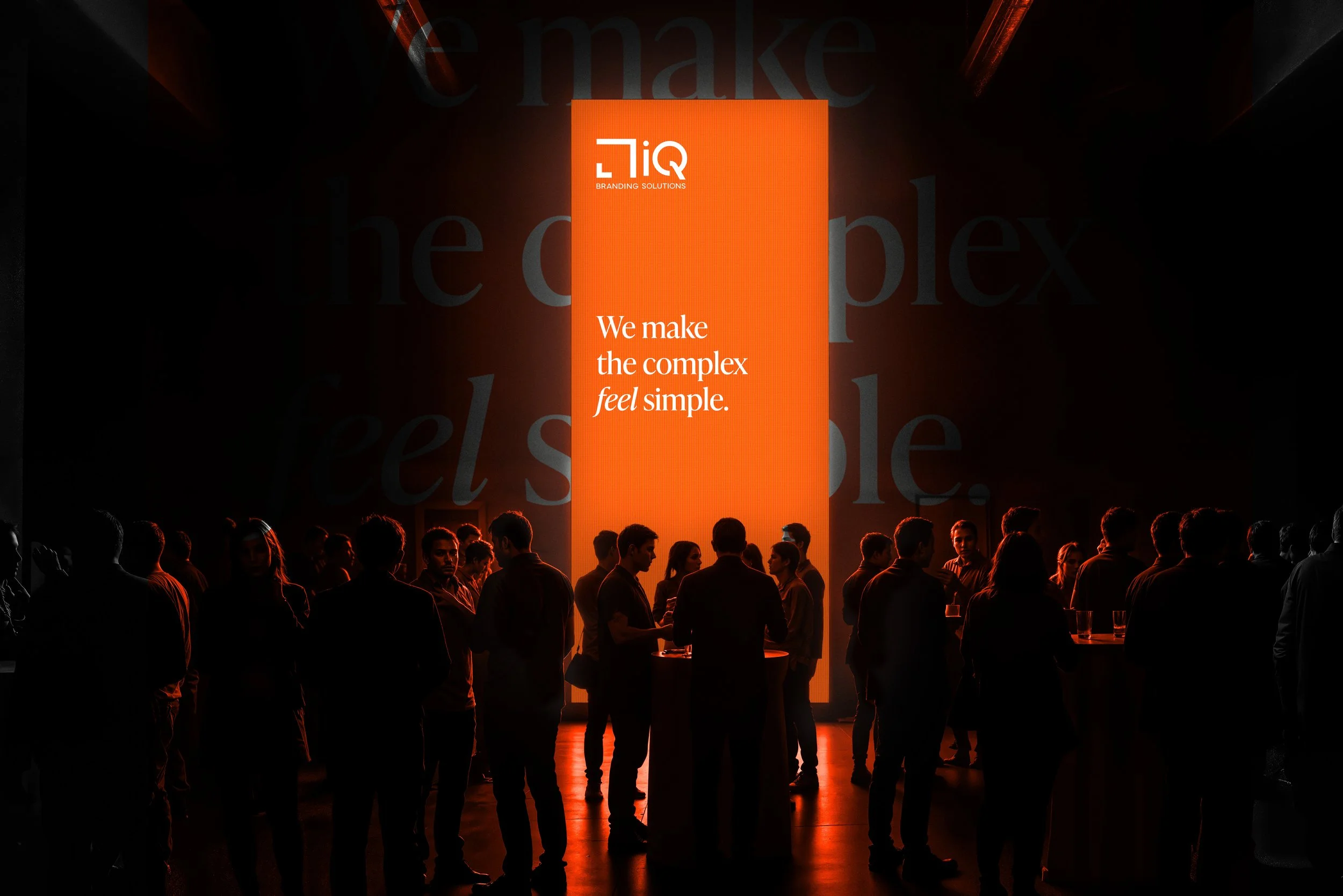
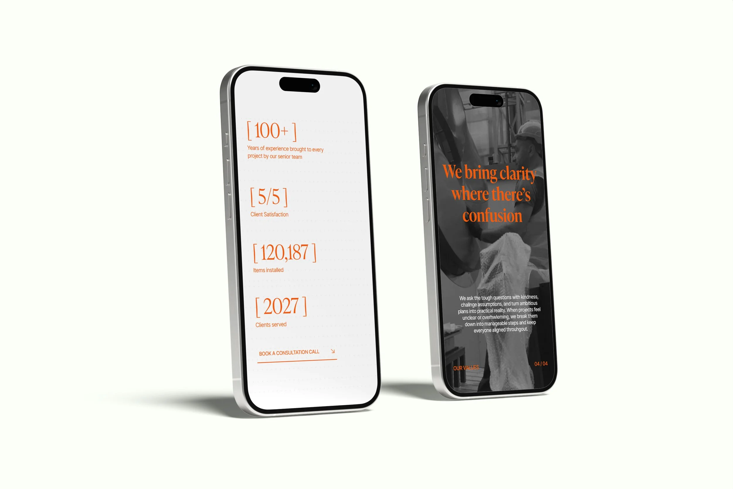
The insight was simple but powerful, clients don’t just stay for the quality of the work, they stay because working with iQ Branding Solutions feels easy. Co-ordinating all the moving parts of branded environments and signage is a complex task. Clients wanted someone who made it feel like a downhill stroll not an uphill battle. That became the brand’s POV…
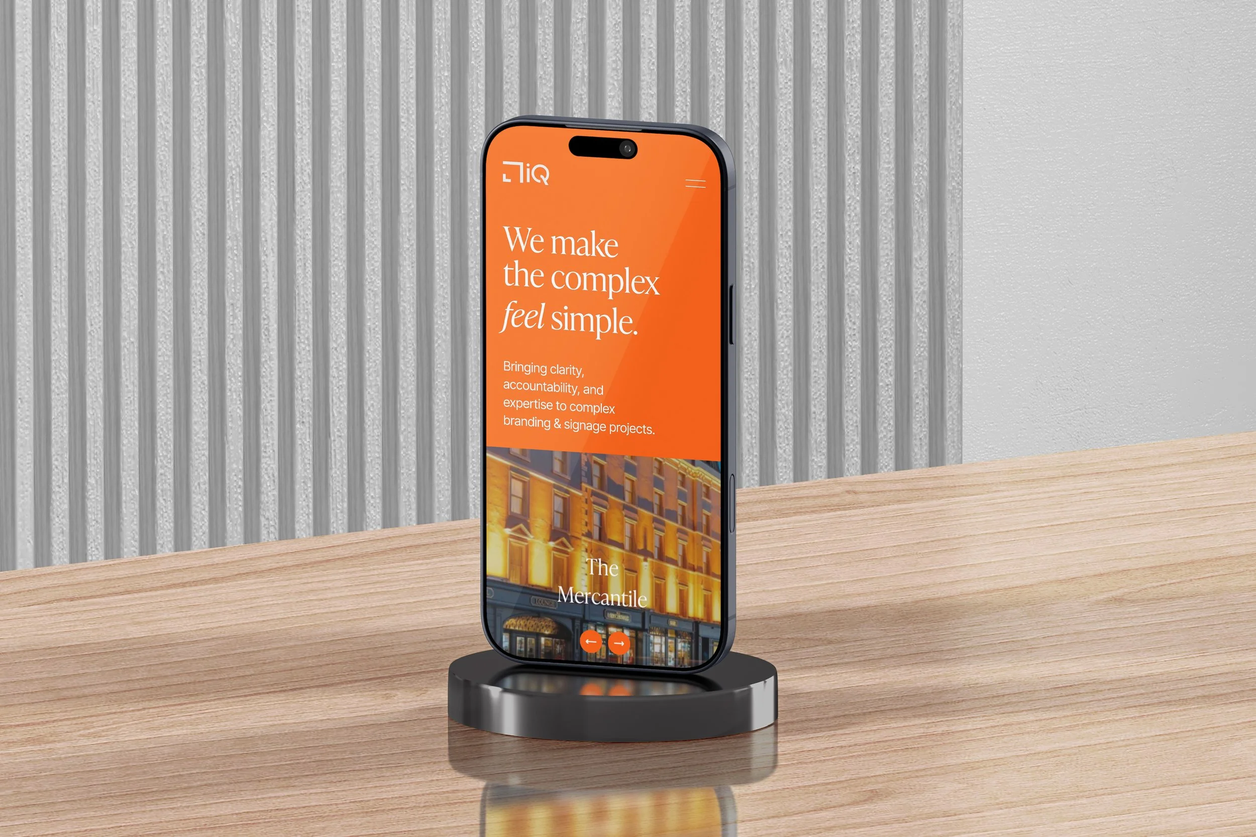
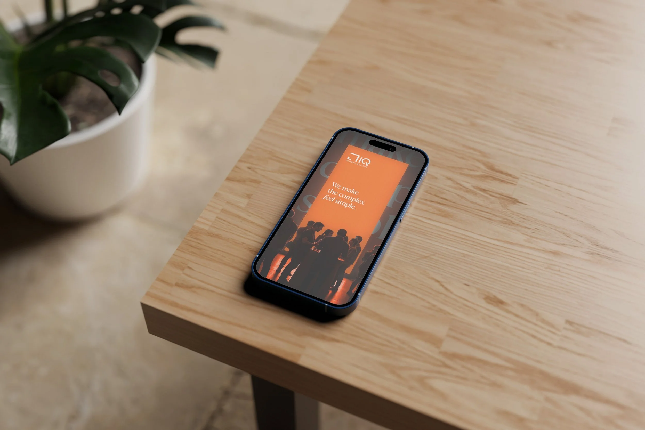
”Making the complex feel simple”.

[ Identity ]
The identity was built on the same principle as the strategy; making the complex feel simple. Inspired by Swiss design, every element was pared back so their work could speak first.
We refined their signature orange, grounding it with navy, cream, and soft pink for depth and warmth. The typography struck a balance between human and utilitarian bringing warmth and order.
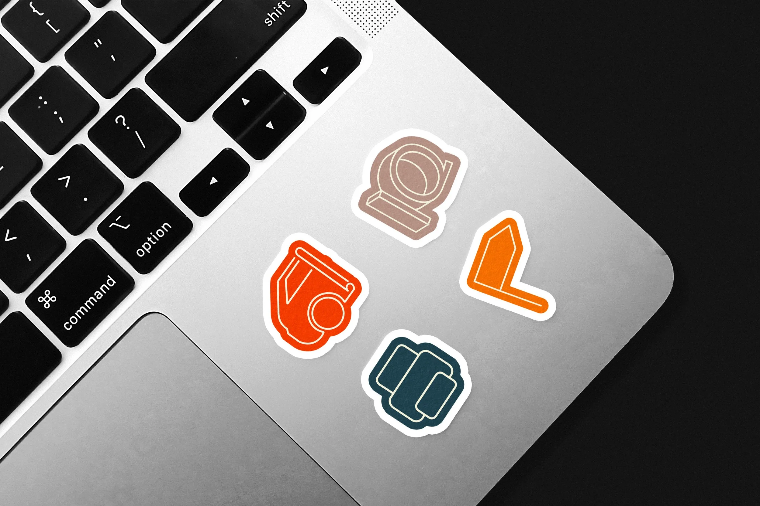
A subtle dotted pattern drew from the sketching and blueprint sheets that guide each project from concept to final install. Finished by a custom icon system and modular grid to bring order across all brand materials.
[ CLIENT TESTIMONIAL ][ Jannetje van Leeuwen, Co-Founder, iQ Branding Solutions ]“Exceptional branding and website design. Orlaith and her team at OD&C refreshed our brand and built our new website, exceeding expectations. They were professional, creative, and really understood our vision.
Communication was excellent, and the final result is both beautiful and functional. Highly recommend!”


Website

iqbrandingsolutions.ie
[ SOCIAL MEDIA & EMAIL LAUNCH ]