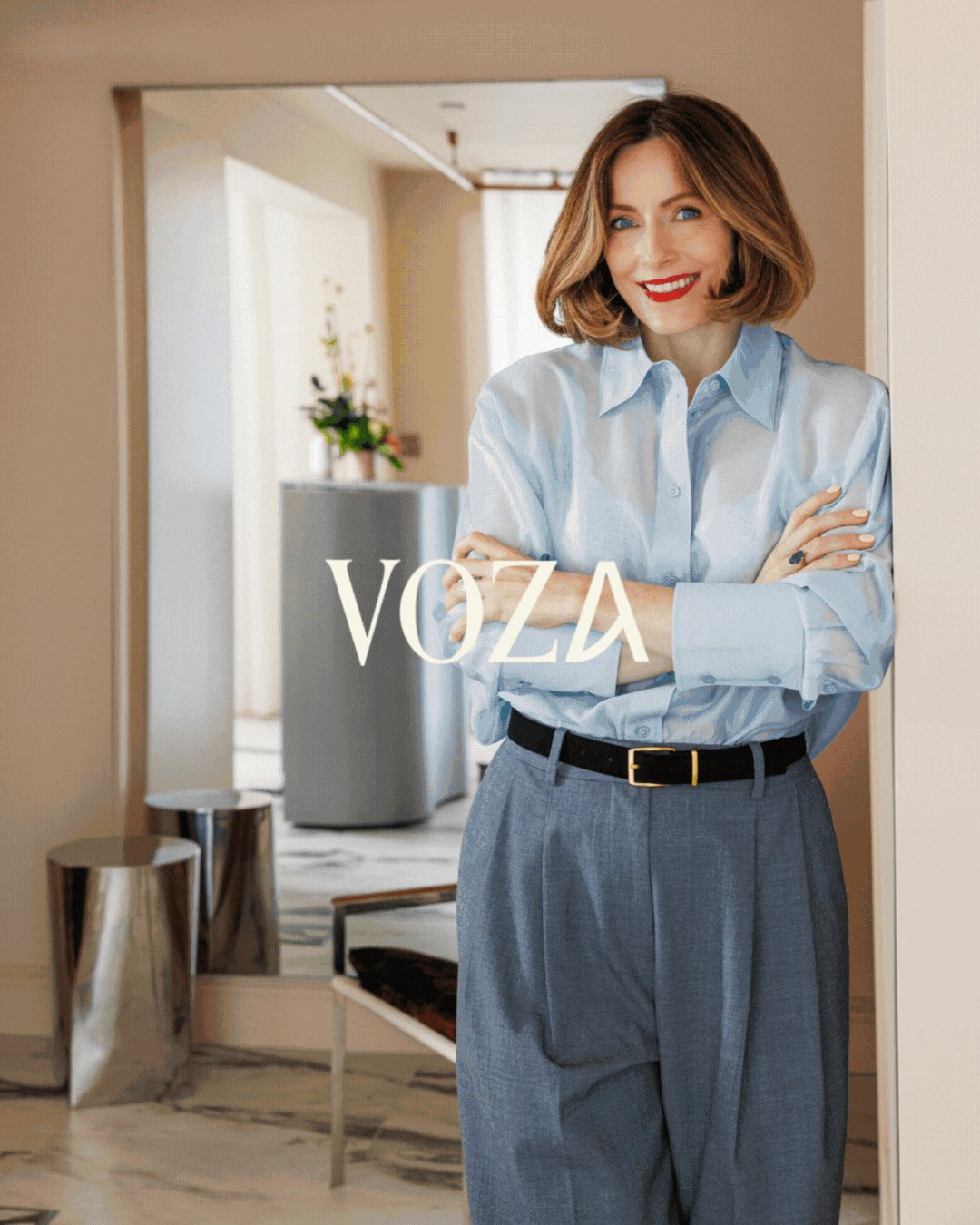
VOZA
Voza launched into a flagship city-centre location evolving from a founder-led clinic into a destination brand, with a complete brand system from naming to packaging.
[ THE TRANSFORMATION ]-
Naming workshop & due diligence to go from founder led Melissa Ferguson Skin Studios to scalable brand VOZA.
-
With significant investment being made into a new location, the business needed a strong market position, clear point of difference and a brand built for scale to support its next stage of growth.
-
We transformed Melissa Ferguson's vision and expertise into a brand capable of supporting growth, recognition and long-term brand equity beyond her reputation and name.
-
Extended the brand into a full packaging suite. Our retail-ready packaging system supported the clinic’s gifting, product sales and a consistent customer experience beyond the treatment room.
-
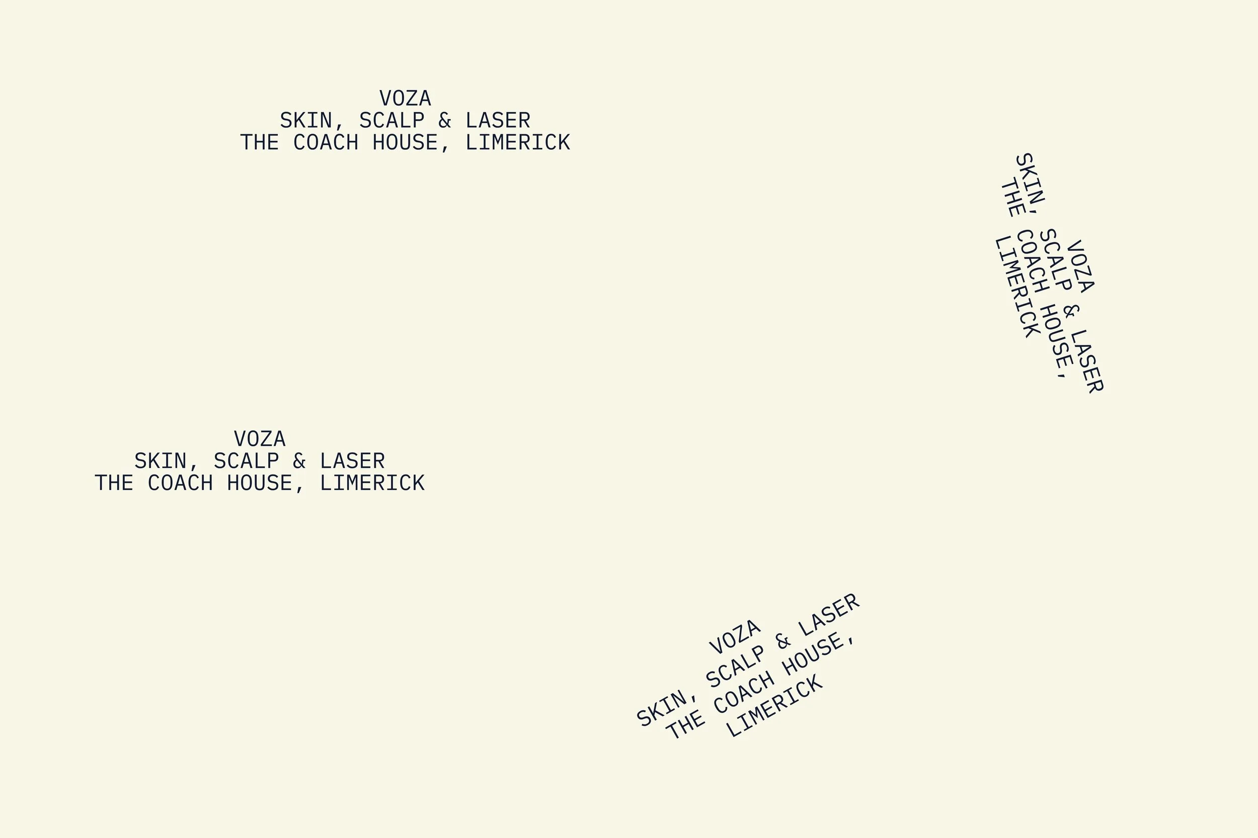
The new location needed immediate visibility to support marketing as construction happened. We developed a phased environmental branding system—from "Coming Soon" through to permanent clinic branding—to introduce VOZA to thousands of city-centre passers-by.
-
Created a social media system that allowed the team to introduce the new brand consistently across digital channels from day one.
PHOTOGRPAHY: KIRSTY LYONS
INTERIOR DESIGN: SERPENTINE INTERIORS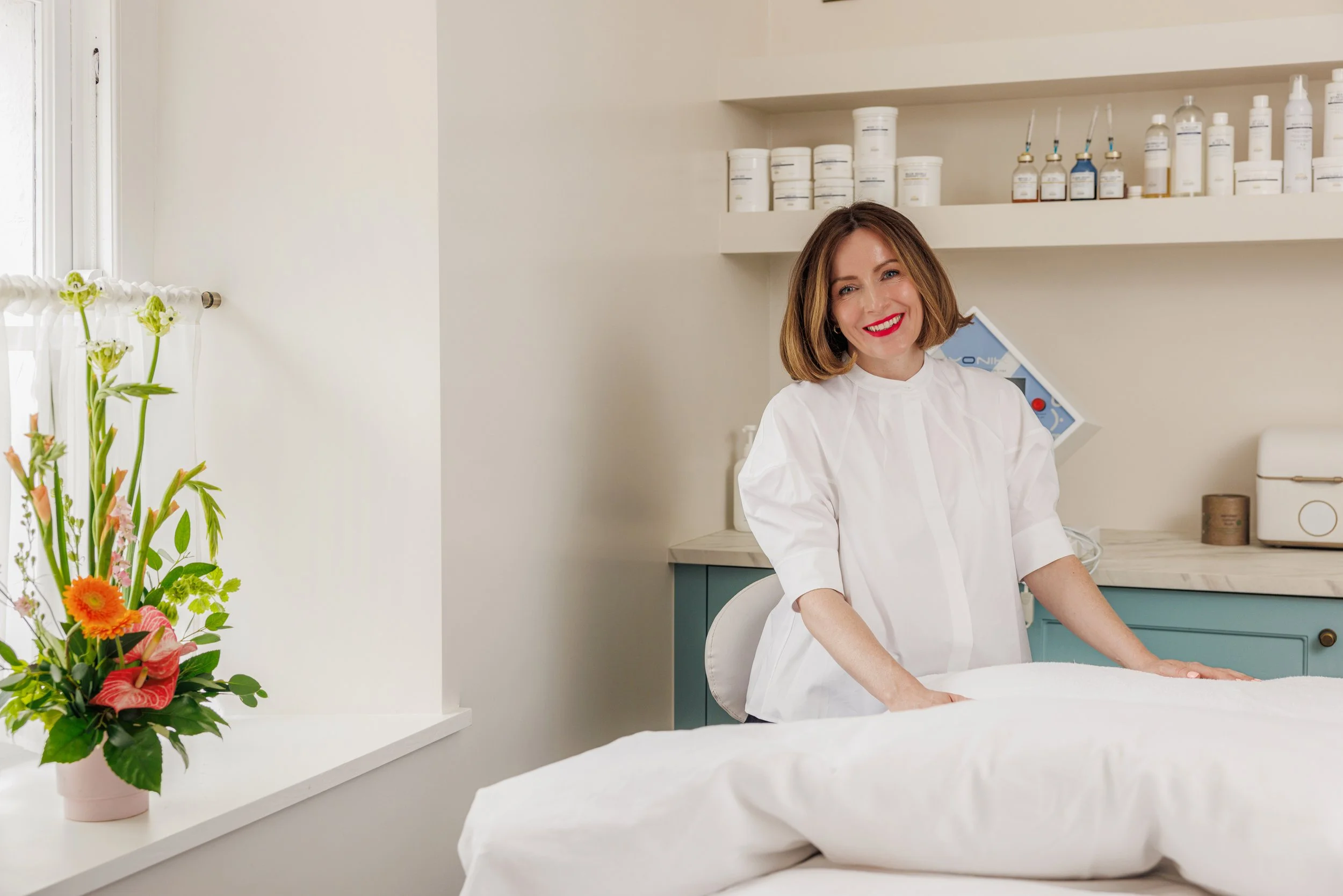
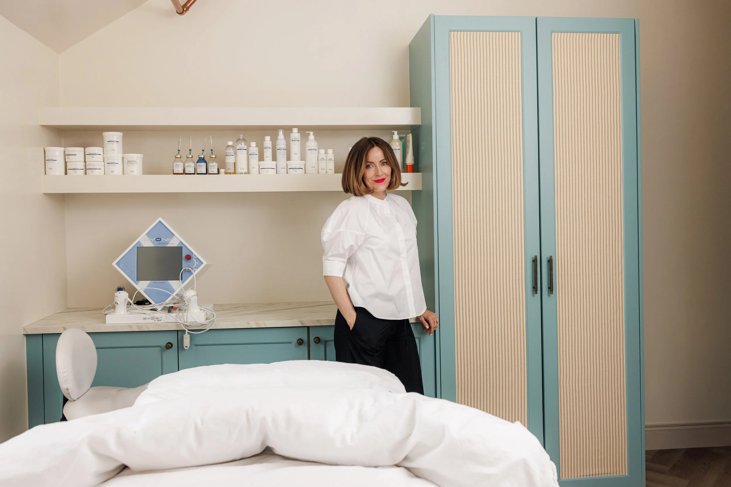
The Challenge
With significant investment being made into a flagship city-centre clinic, this founder-led clinic needed a stronger market position, clearer differentiation and a brand built for scale.
Through naming, positioning, strategy, identity development and packaging we transformed the business into a recognisable destination brand ready for its next chapter of growth.

The Results
VOZA's was moving into its next stage of growth. We worked with it’s founder Melissa to pull out the key themes customers loved and the areas that needed to shine to get even more customers.
Looking at the business goals we built a brand around them that would grow into the future. We developed the naming, support for interior design, launch and permanent window graphics, launch marketing, social media assets and a retail-ready packaging suite.
Every touchpoint was designed to work together—building recognition, strengthening perceived value and ensuring the investment in the new location delivered maximum impact.
From phased "Coming Soon" window graphics that introduced the brand to thousands of city-centre passers-by, to launch-ready marketing assets and packaging designed to support gifting, retail and future product opportunities, the brand was built to create visibility before opening and consistency long after launch.
The result was a recognisable clinic and brand with equity beyond the founder's name—that attracts the right audience and gives a scalable foundation for future growth and revenue goals.

[ client review ][ Melissa Ferguson, Founder & Clinic Director ]“Loved working with you Orlaith. You smashed it! Our new branding is dreamy. You were patient and kind through the whole process and most importantly you really listened. I hope we can work together again. Thank you so much.”

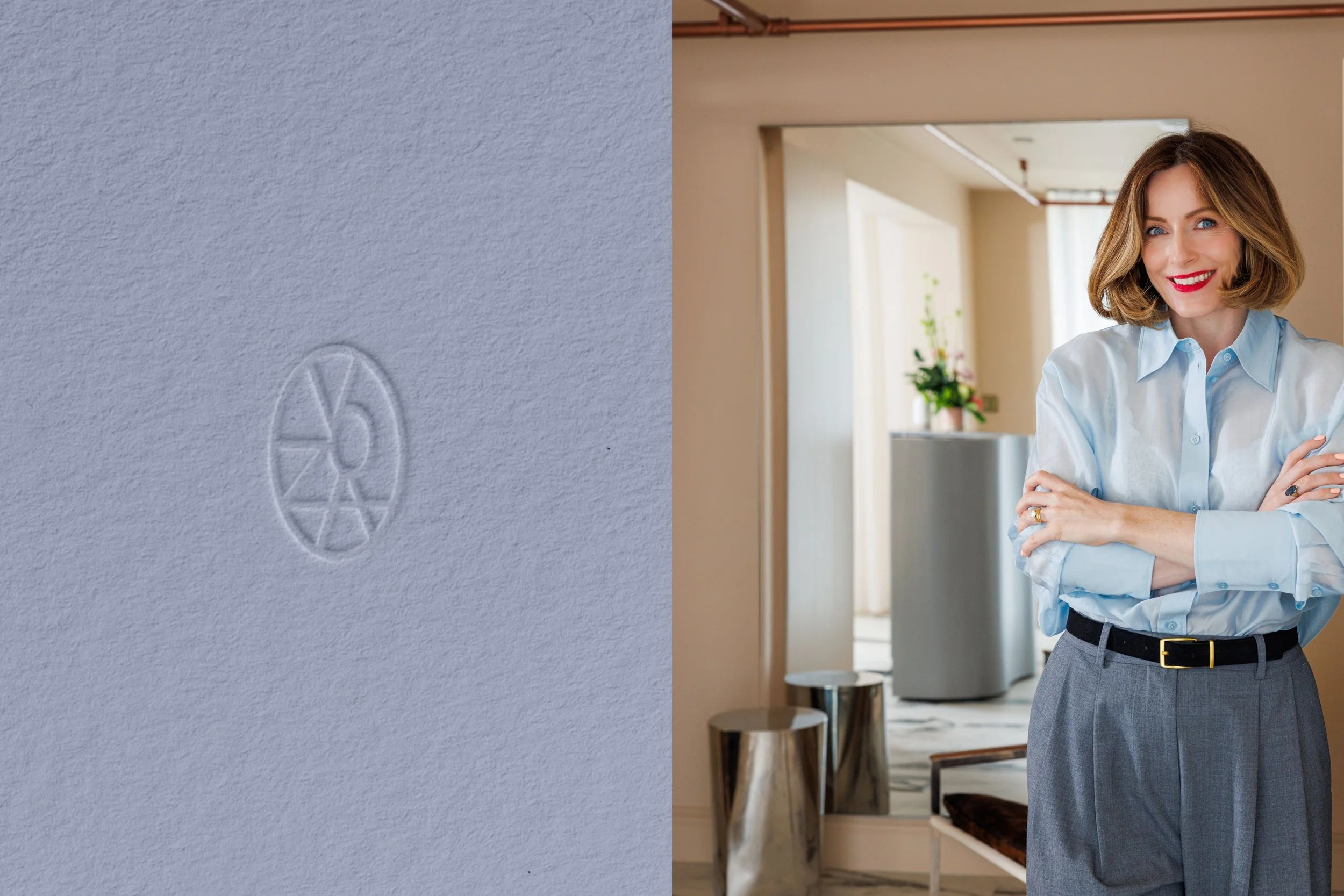
Naming
Attached to a Palladian-style building from 1775, VOZA’s new space carries both history and presence. Through a naming workshop, we evolved ‘Melissa Ferguson Skin Studios’ into something sharper. Something chic, playful and unafraid.
The result was VOZA — “Vo” a soft, open vowel sound. It feels smooth and flowing when spoken. “Za” for the punch of energy and eccentricity that sets it apart.


Identity
VOZA’s new identity is anchored in its setting and spirit. Attached to a Palladian-style house on Henry Street, the brand roots itself in history while carving out something fresh.
The brand draws on architectural cues — arches, circles, and symmetry — to shape its symbol: VOZA held within an oval, a balance of heritage and modern clarity.
The palette of light blues, deep navy, creams, and yellow reinforces a mix of timeless yet playful. Typography continues the conversation, bridging classic forms with contemporary edge — much like the brand itself: personal, spirited, and distinct.


[ First impressions in the city-centre location ]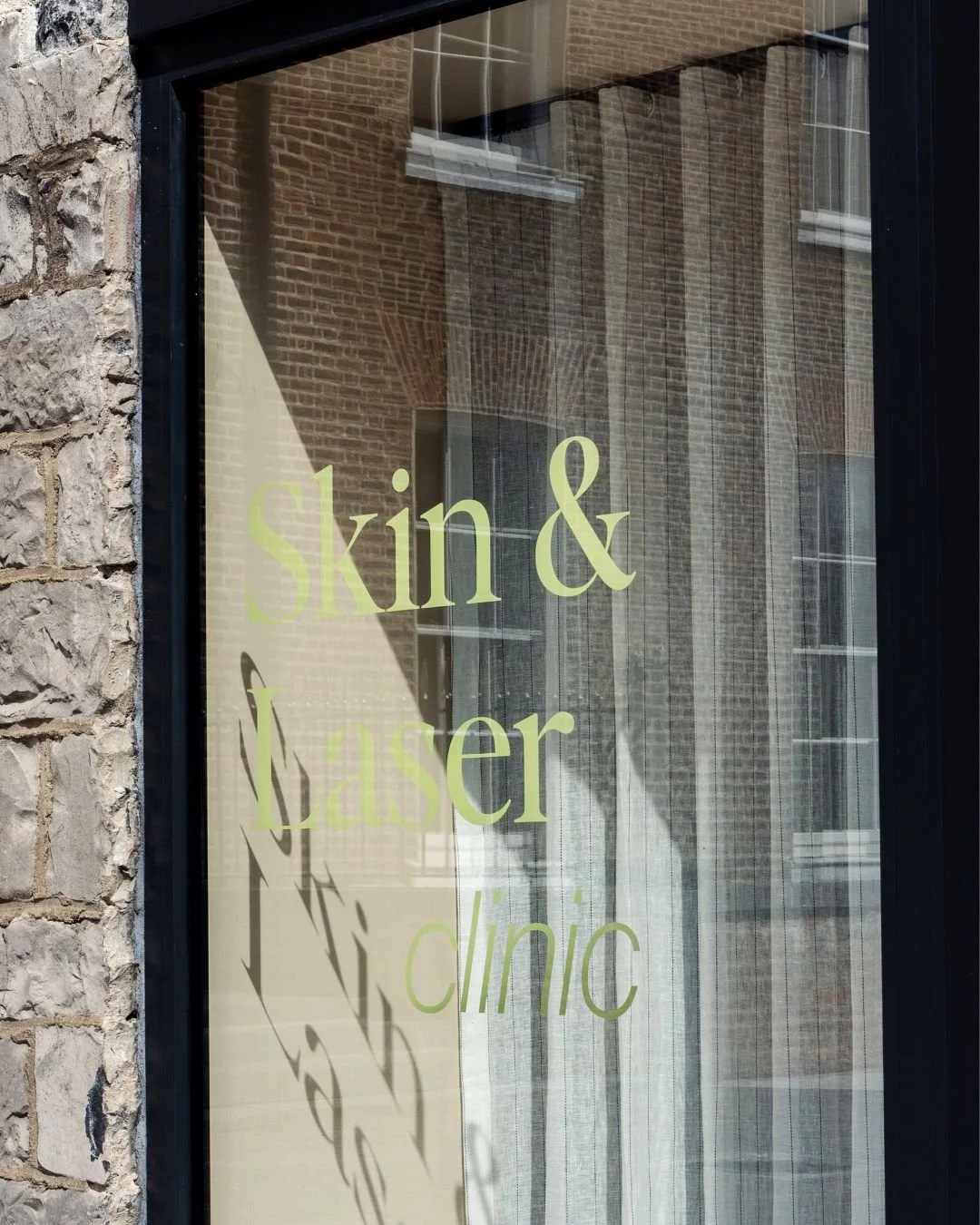
[ launch ready design system ]